
Grid and Layout Guidelines
Smartsheet
Smartsheet is a leading product suite for managing projects, workflows, teams and much more. As part of the design systems team, I led efforts to enhance the design system and establish grid and layout guidelines.
Responsibilities
Design Research and Strategy, UI Design, Cross-functional collaboration, Documentation
Team
1 Product Designer, 1 Principal Designer, 1 Design Technologist
Overview
As the foundational elements of a design system, grid and layout were yet to be introduced into Smartsheet's new design system.
The design systems team at Smartsheet was gradually switching to a new and modern design system and this was a good opportunity to setup these foundational elements. Without grids, making decisions about where items should sit on the page, and maintaining visual consistency across multiple projects would be challenging. But to retrofit grids to already existing projects would be a major undertaking, thus these grids were initially targeted for the designers only.
What are Grids?
A grid is a system which helps us systematically organize content within a user interface (UI). And an organized UI helps establish a visual rhythm that helps users to smoothly navigate through the content. Moreover, these UIs also vary based on the different screen sizes (that users may be using) and have unique layouts as well.
Why do we need them?
For designers (like me), grids are valuable as they offer a good starting point for our designs and
allows us to make design decisions
based on a documented structure. Thus, by following these guidelines, design teams within an organization
can create UIs which are consistent, efficient and cohesive across the organization.
Moreover, for the end-users (or customers) and for the business, these foundational elements are very
helpful as they facilitate predictability while navigating, which fosters a sense of familiarity with the
product and thus improves user retention.
My process
I broadly followed a dynamic process for this project, which was divided into phases and involved sub-steps to achieve the end goal.
Research and Analysis
I started off by taking inspiration from other design systems and how do they offer these foundational elements, understanding how do they differ and what are the unique aspects I should consider for our platform.

Following were some of the common aspects which I identified:
- Choice of grid - fluid & fixed width
- Number of columns
- Margins
- Gutter spacing
- Breakpoints
- Layout options
- and a few more...
In-depth Platform Audit
In this phase, my goal was to develop an understanding of the overall Smartsheet UX and identify that are the matching UI patterns which can be established for the screens. This phase provided me answers to A LOT of questions, which helped clear ambiguity and proceed with a direction. Some of the questions were:
- How do designers currently design the screens?
- Are there any generalizable screens?
- Are there any layout constraints?
- Are there any technical constraints?
- and many more...
Initial Proposal
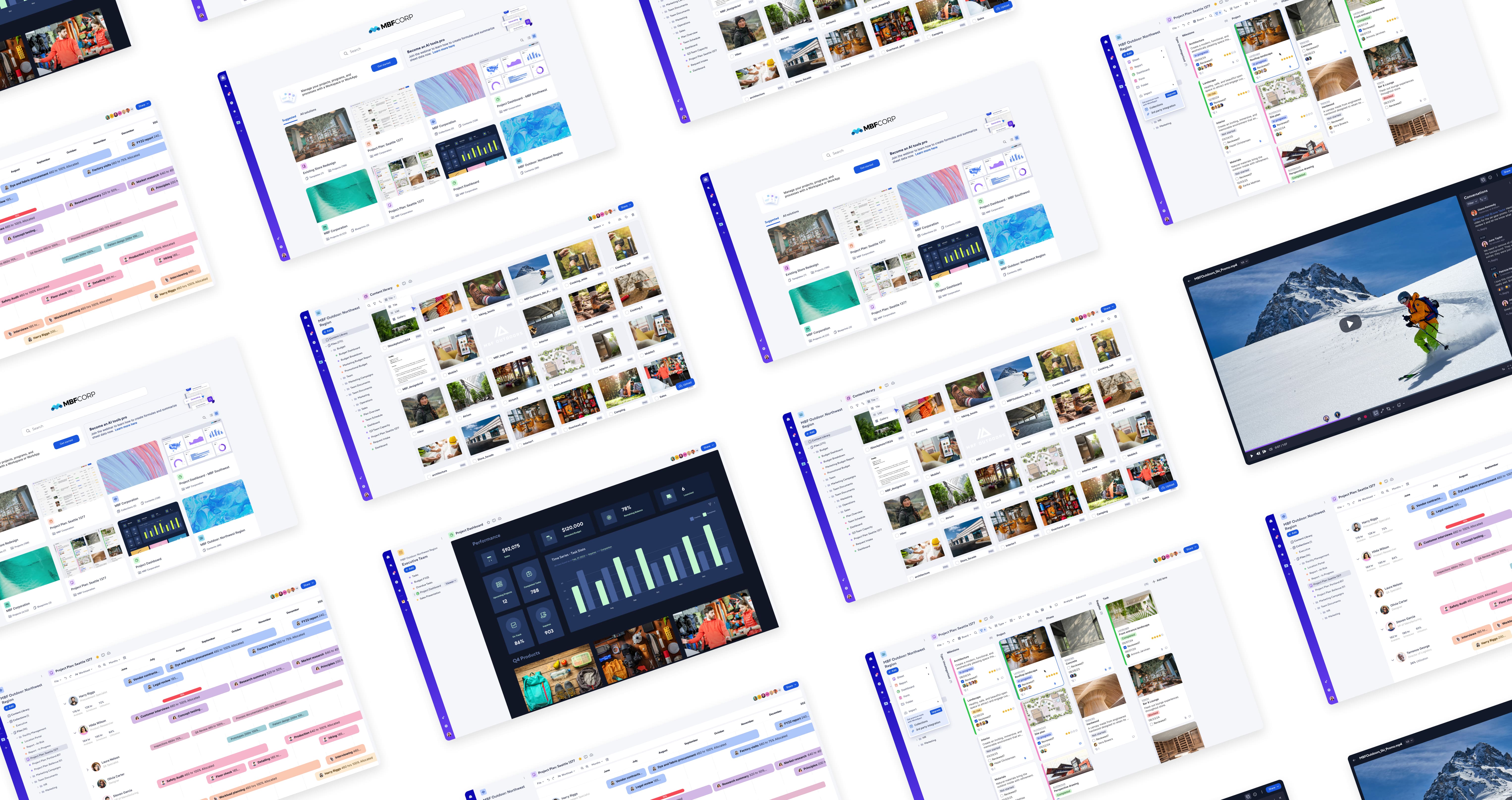
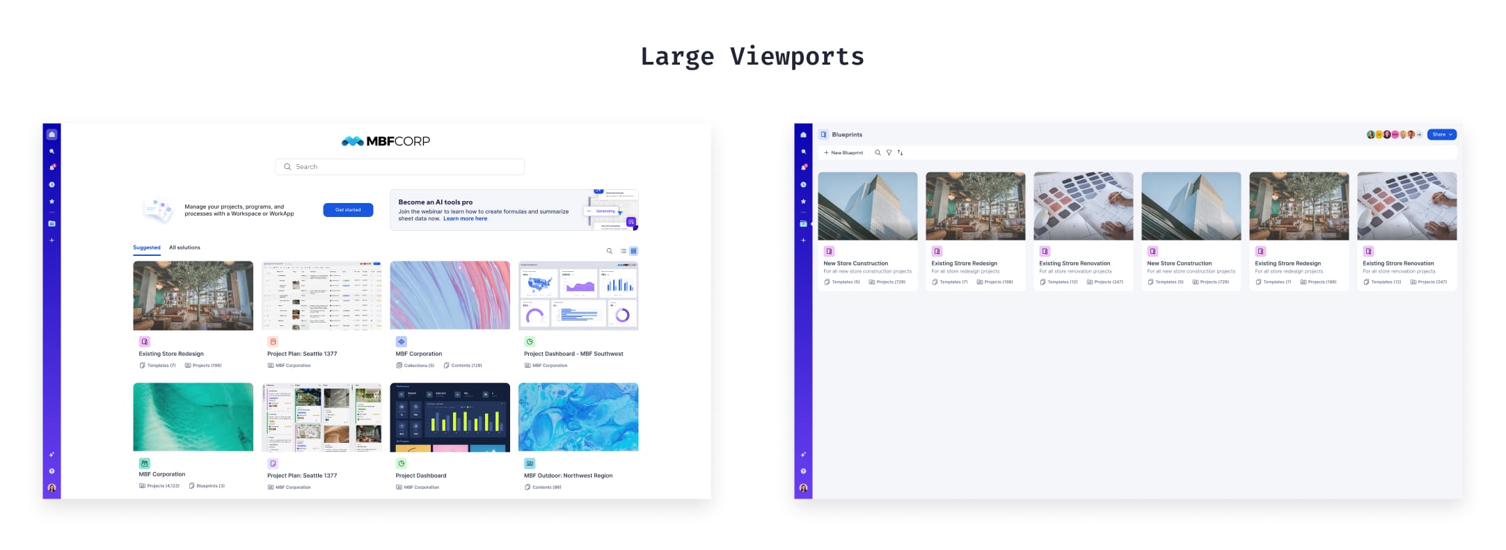
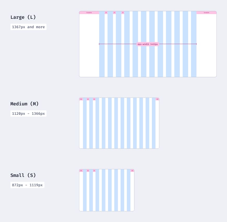
Through my initial explorations for larger viewports, I chose a 12-column grid for its versatility in accommodating both symmetric and asymmetric layouts. This flexibility is particularly beneficial for Smartsheet's use cases, such as customizable dashboards, where diverse and dynamic layout options are required.
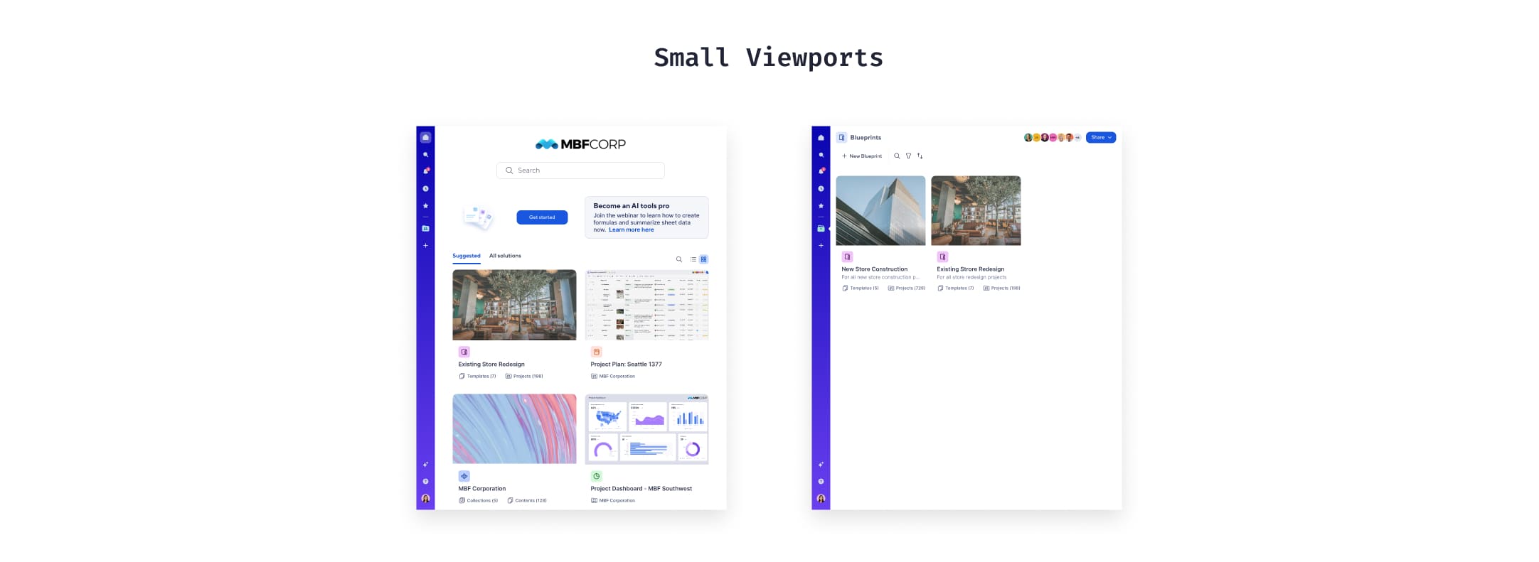
However, for smaller viewports, the 12-column grid became impractical due to the limited screen width. In these cases, single-columns are no longer effective. To address this, I proposed using different grid structures for various breakpoints (Large, Medium, Small), as smaller viewports required less complex layout flexibility.
Because some designers were new to the concept of grids and layouts, I also created guidance documentation within figma which designers can refer during the workshop.
After the initial proposal, I collaborated with my team to develop a set of foundational elements that define our grid and layout guidelines.
While aiming to create a scalable solution adaptable to both current and future Smartsheet projects, the guildlines included the following elements:
Grid Elements
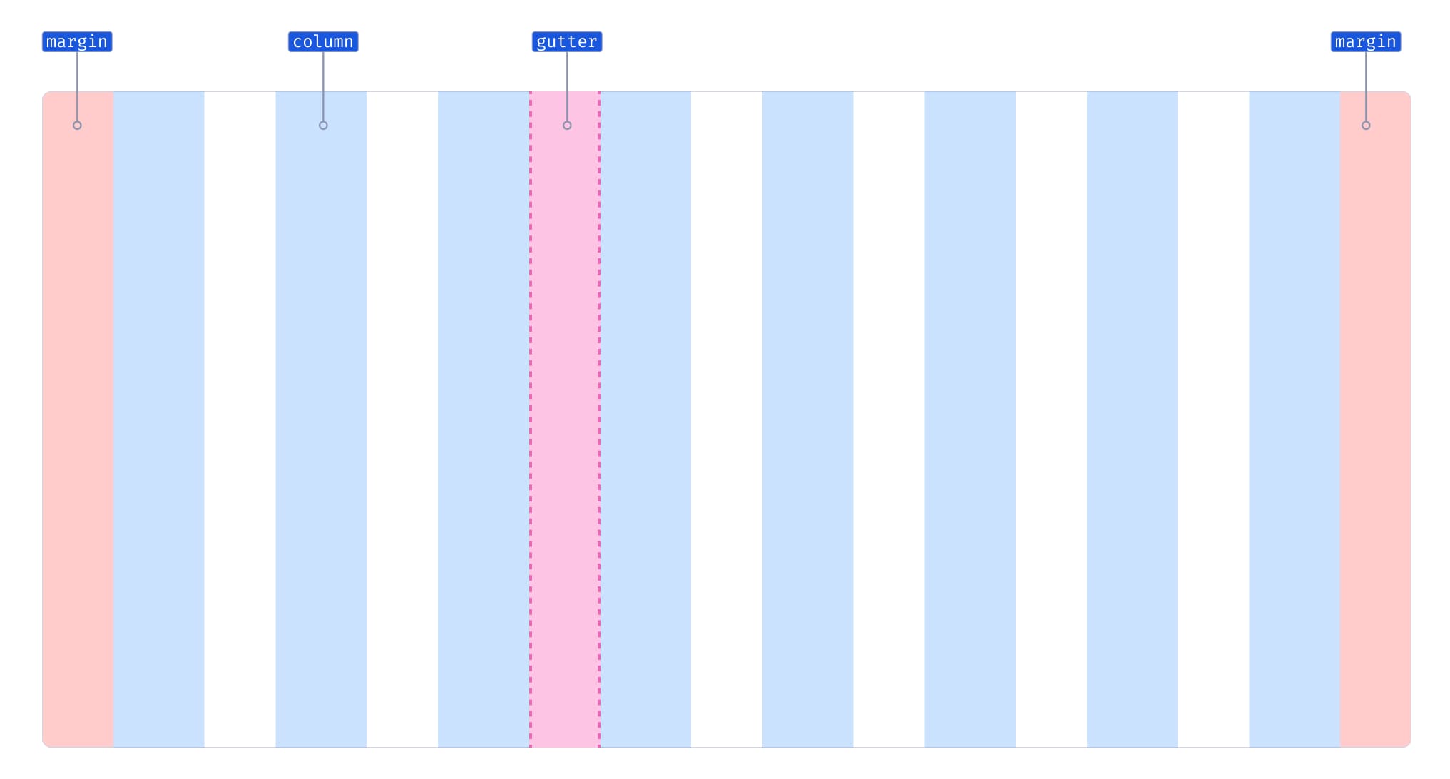
- Grid Columns: The building blocks of a grid and offer guidance on aligning the content. Number of columns were decided based on the breakpoints, and varied based on the viewports i.e. larger viewports used more grid columns and smaller viewports less.
- Margins: They are the fixed negative spaces at the outer edge of the grid, and prevent content from overflowing. While margin values were generally consistent across Smartsheet projects, they occasionally varied based on viewport sizes. I defined default values for teams to follow, while also providing alternative options for cases that require flexibility.
- Gutters: The space between columns which offers guidance on the consistent spacing between the elements. These spacing values vary by viewport, with larger screens requiring more space and smaller screens requiring less.
Breakpoints
Breakpoints play a crucial role in grid creation, allowing grid elements to adapt to different screen sizes. They also enable designers to fine-tune layouts responsively, ensuring that scenarios not covered by standard viewports are effectively addressed.
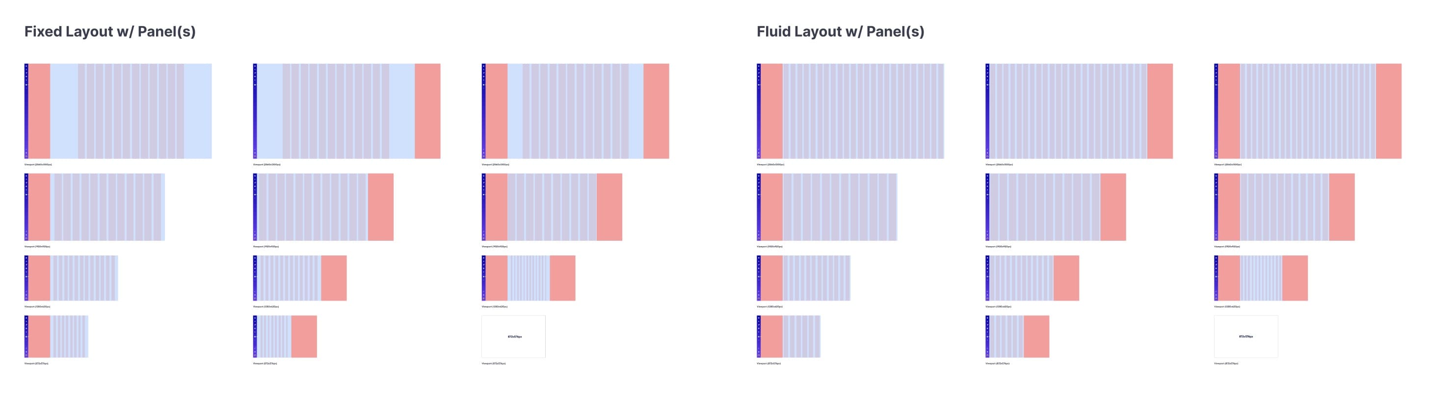
Layouts
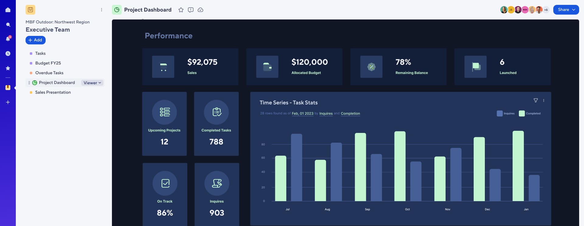
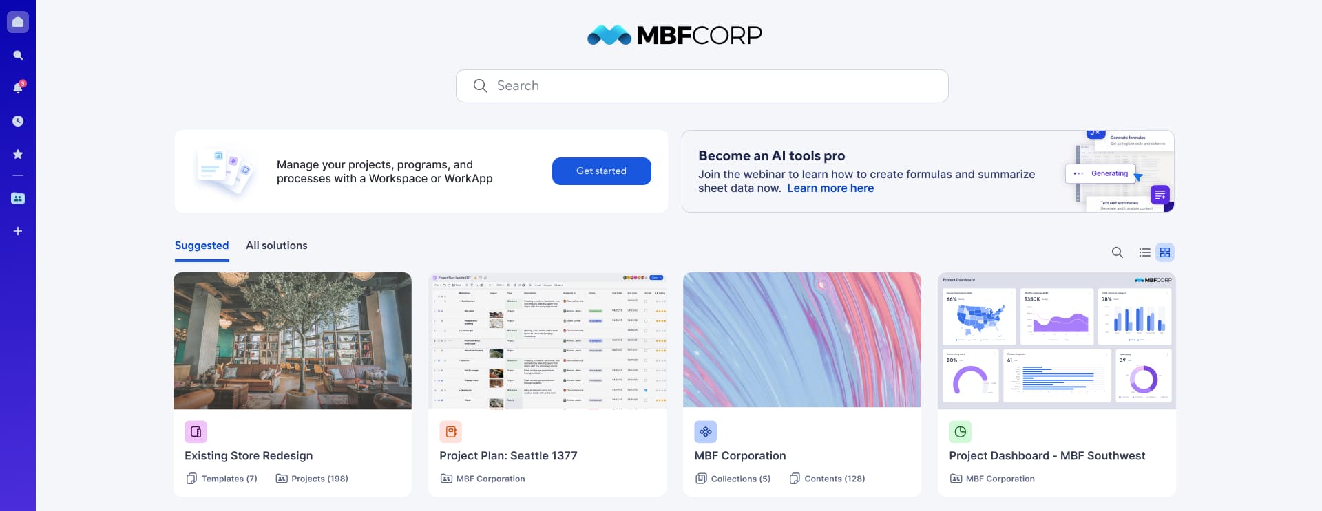
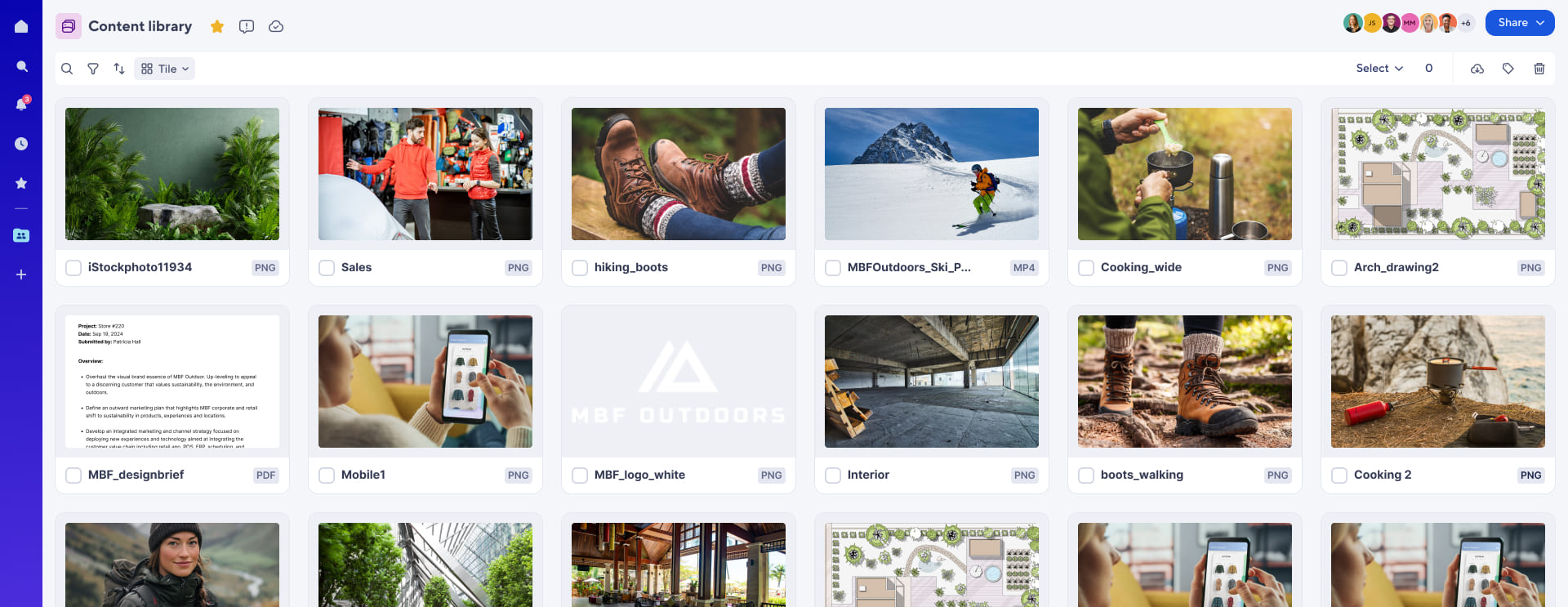
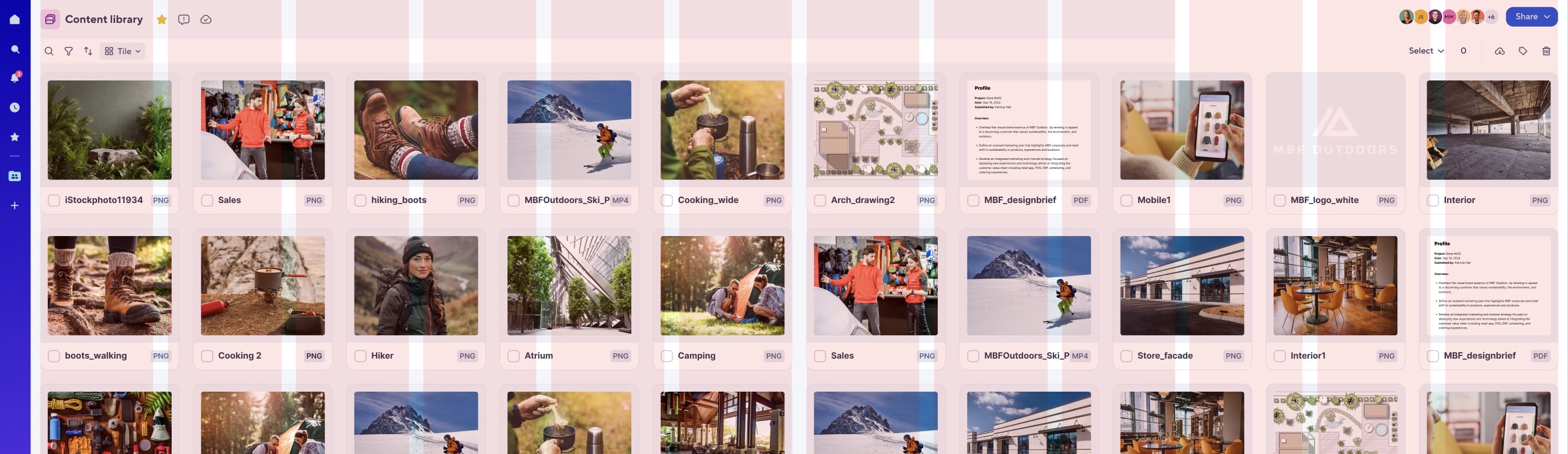
Layouts are a set of structural templates that offer consistency across various screens of our platform by defining spacing and grids. Having a consistent layout across our platform allows our customers to focus on their tasks rather than developing new mental models for different screens. After analyzing all the Smartsheet screens, I categorized the page content into different layouts:
Problems found with the initial proposal
The fixed-width grid worked well, but the 12-column full-width grid couldn't scale beyond 1920px. Its inability to adapt to larger viewports made it unsuitable for Smartsheet's flexible, responsive design needs. While fixed grids maintained consistency, full-width layouts required more adaptability—something the 12-column grid couldn't provide for varying screen sizes.
Determining ideal margins and gutters for the grid proved challenging due to inconsistent spacing across screens, as designers had no established guidelines. Retrofitting the proposed grid resulted in UI elements, like cards, being either too narrow or too wide. I also found a lack of minimum and maximum width values for key elements, leading to inconsistent sizing by designers.
The consideration of projects from companies acquired by Smartsheet was overlooked. During the workshop, designers flagged this issue, which I then raised with my design systems team, ensuring it was addressed moving forward.
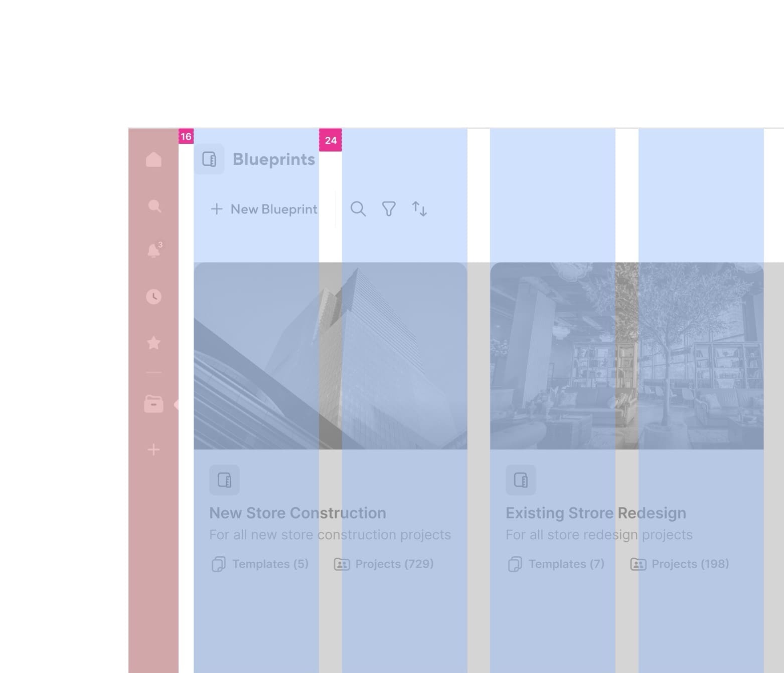
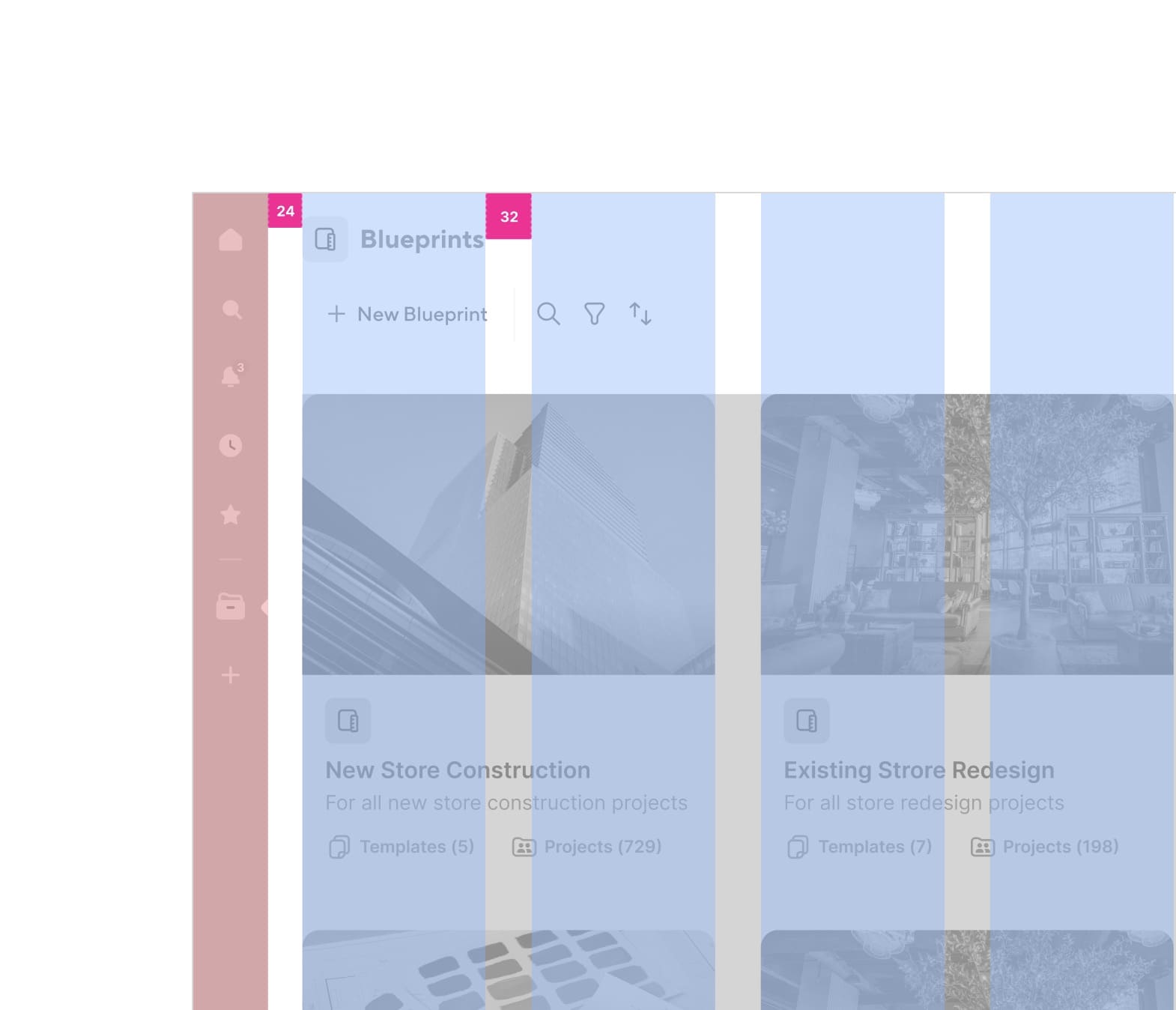
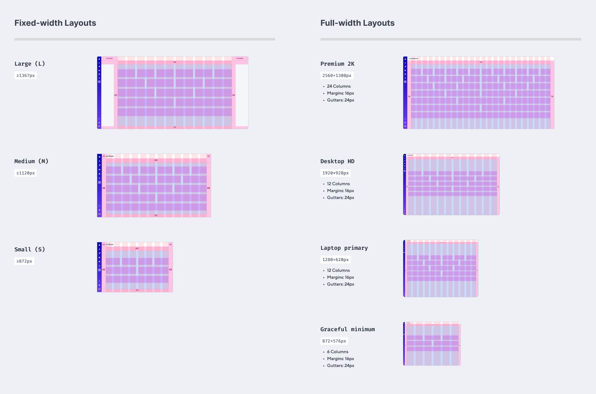
Solution Proposed: 24-column grid for large viewport
The 12-column full-width grid couldn't support fluid layouts on large viewports beyond 1920px, leading me to explore
alternative solutions. After testing various options, I decided to go ahead with a 24-column grid.
This solution provided greater
flexibility in adjusting UI element widths within the content area and enabled designers to create new and update
existing layouts with ease. With the additional columns, designers can create cohesive, visually consistent layouts that
easily scale for larger viewports.
Testing the proposed changes
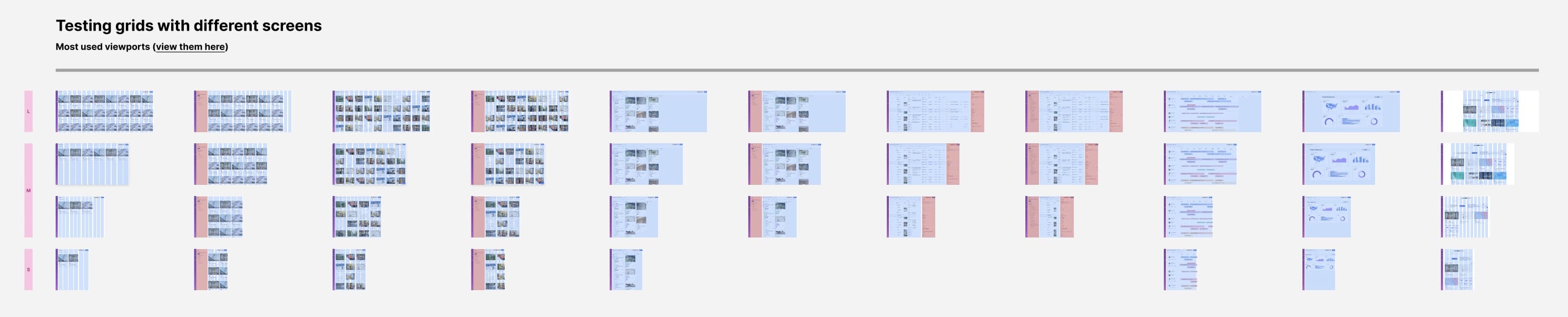
I tested the 24-column grid across different screens, layout needs, and use cases to ensure it would work for both current and future projects. This included verifying that the grid could support integrations from Smartsheet's acquired companies, ensuring it was adaptable and scalable across all anticipated design requirements.
Later, I also tested the grids with various layouts and content types across different screen sizes, including small, medium, and large viewports, to ensure they would perform well across all types.
After all the possibilities were considered and problems addressed, I created a final proposal for grid and layouts guidelines.
This phase focused on organizing and presenting the finalized information in a way that was easy for designers to access and apply in their daily work. The goal was to ensure that the guidelines were not only clear but also practical and readily usable in the design process.
Final grids and layouts proposal
After thorough testing and validation, we finalized the grid and layout solutions. The finalized grid configuration is shown below:
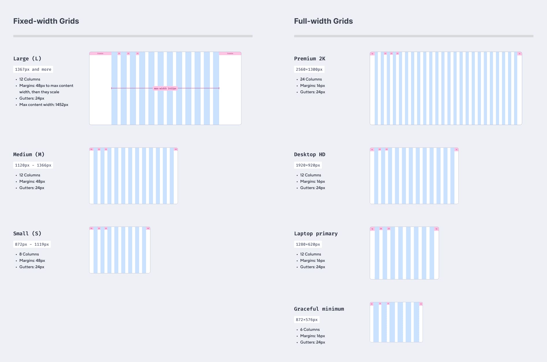
These grids will be applied to various layouts currently used on Smartsheet screens, with the number of columns adjusting based on each layout and viewport size.
Also, these new guidelines offer endless design possibilities across screen sizes due to the highly flexible column combinations.
The impact of my work
The grids and layouts guidelines were shipped to 8 UX teams, 90+ designers and are an integral part of Smartsheet's design system as the new foundational elements.
Increased design consistency
Designers from different teams have a common set of guidelines to follow, which will help them create consistent designs and help establish cohesive design practices across the organization.
Explore, ideate and ship faster
With these guidelines setup, designers know the design constraints beforehand which eliminates the need to spend a considerable amount of time identifying them.
Responsive viewport guidelines
Designers can now visually share their designs for different viewport sizes as well, making the cross-functional collaboration efficient.
Learnings and reflections
My internship at Smartsheet was the most fulfilling experience I've had, which exposed me to many different aspects of a design system.
Beyond setting up a design system
The design systems team was in the process of transitioning to a new design system, I got exposed to the best approaches of doing so. Moreover, this also helped me understand how to maintain a design system.
Leveraging systems thinking
Beign a part of the design systems team (consisting of Product Designers, Design Engineers and Product Managers) and collaborating with different UX teams, I got the opportunity to make systems level decisions for my project.
Working with tech constraints
I realized the importance of my prior experiences as a Software Engineer. I got direct opportunities to contribute code changes to our design system files and handling end-to-end processes right from the beginning.
Collaboration is the key
Working in a highly accountable team within the design org meant that every cross-functional UX partner's requirements are important. Thus, through strong collaboration we were able to ensure that.