Redesigning an enterprise software
Johnson Controls
ExacqVision is a software used by security professionals to manage security devices across premises. The goal of this project was to redesign the software to make it more user-friendly and modern.
Responsibilities
Information architecture, Competitive Analysis, Wireframing, Prototyping, Interaction design, Usability Testing
Team
2 Product Designers, 1 UX Researcher, 1 Product Manager
Overview
The software was outdated and needed a modern redesign to stay competitive in the market.
ExacqVision software by Johnson Controls was founded in 2002 (20+ years ago!). This video management system (VMS) provides security surveillance capabilities for its users worldwide, offering simple and easy-to-use interfaces for managing IP and analog devices.

My collaboration with the team at Johnson Controls (JC), involved redesigning their existing desktop software and modernizing it to match today's standards. The JC team felt that their software was outdated and needed a fresh look to compete with similar players in the market.
Moreover, given that the software was used by security professionals who aren't tech-savvy, it was crucial to maintain the simplicity and ease of use of the software.
Research & Ideation
Before we start with the redesign, it was important to learn more about the domain, the competitors and the users.
UX Audit and Competitive Analysis
My goal was to understand the design patterns and the user flows of the competitors in the market. This helped me identify the common patterns and the unique aspects of each software. A majority of them were introduced in the recent years and had a modern look and feel to them. This was a good benchmark for me to start with.

Key highlights from the research:
- User interfaces looked clean and clutter-free with a modern look and feel.
- Consistent hierarchy and human-relatable terminologies were used across the softwares.
- Competitors outperform in easy-to-use interfaces and intuitive navigation flows.
- Most of the competitors used new technologies (like QR code to connect a device) which significantly improve how users interact with the software.
Talking to the users
Through field visits and interviews with 5 security professionals who use the software on a daily basis, we understood their pain points, their likes and dislikes about the software and their expectations from the new software. We were able to validate some of the assumptions from the competitive analysis and also discovered new insights.

With better understanding, we identified some key design opportunities which would be the foundation of our redesign.
We knew that the software needed a modern look and feel, but we also had to ensure that the redesign doesn't mean a complete overhaul of the software. Because it's an enterprise software, users are used to the current interface and changing it completely would mean a steep learning curve for them. Thus, we aimed to make incremental changes to the software which wouldn't disrupt the user's workflow but at the same time, make the software more modern and user-friendly.
- Simpler userflows for device management
Our UX audit and user interviews revealed an abundance of unnecessary steps which impacted the user's efficiency. We aimed to simplify the userflows and reduce the number of steps to complete a task. - Clutter-free navigation sidebar for visual hierarchy
The current software had a cluttered sidebar with multiple options which made it difficult for users to find the right option. We aimed to declutter the sidebar and provide a clear visual hierarchy. - Improved discoverability of features
The software had many features which were hidden under multiple layers. We aimed to improve the discoverability of these features by making them more accessible. - A clean and modern user interface
The software had an outdated look and feel. We aimed to modernize the software by introducing a clean and modern user interface.
Designing and Testing
Although I had a clear direction from the research phase, the design phase was iterative and involved multiple rounds of feedback and testing.
I started with wireframes and low-fidelity prototypes to quickly iterate on the design ideas. I conducted multiple rounds of feedback sessions with the users and the stakeholders to refine the design. I then moved on to high-fidelity prototypes which were tested with the users to validate the design decisions.
Introducing a dashboard
Something the software lacked was a dashboard which could provide an overview of all the features offered. Users shared that they often had to navigate through multiple screens to find the right feature and that it was time-consuming. They wanted quick access to the most used features and a list of activities they performed recently to identify any issues.
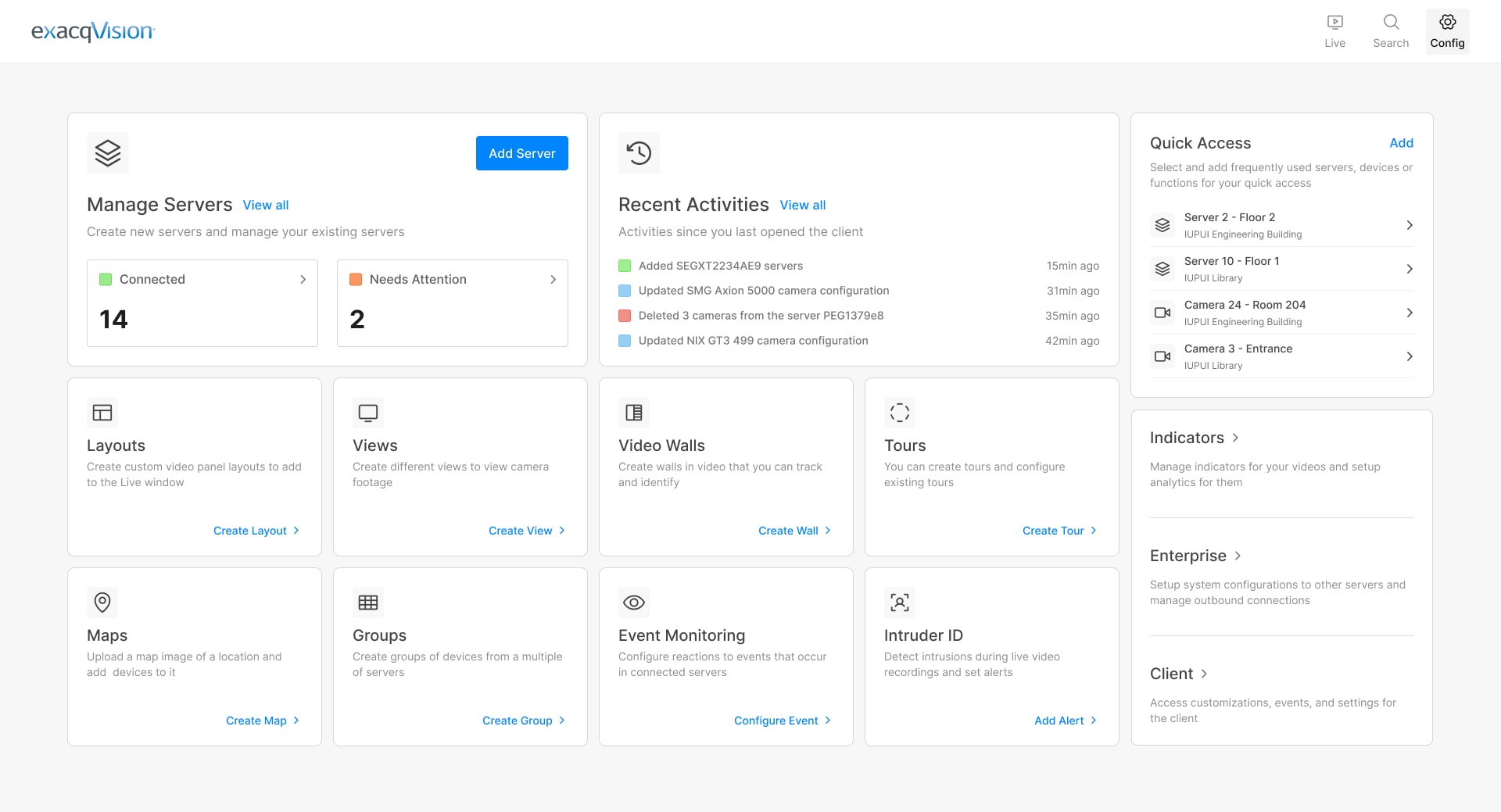
The existing server list screen was cluttered and had a lot of information which was not relevant to the users. I redesigned the screen to provide a clean and clutter-free interface which only showed the relevant information.

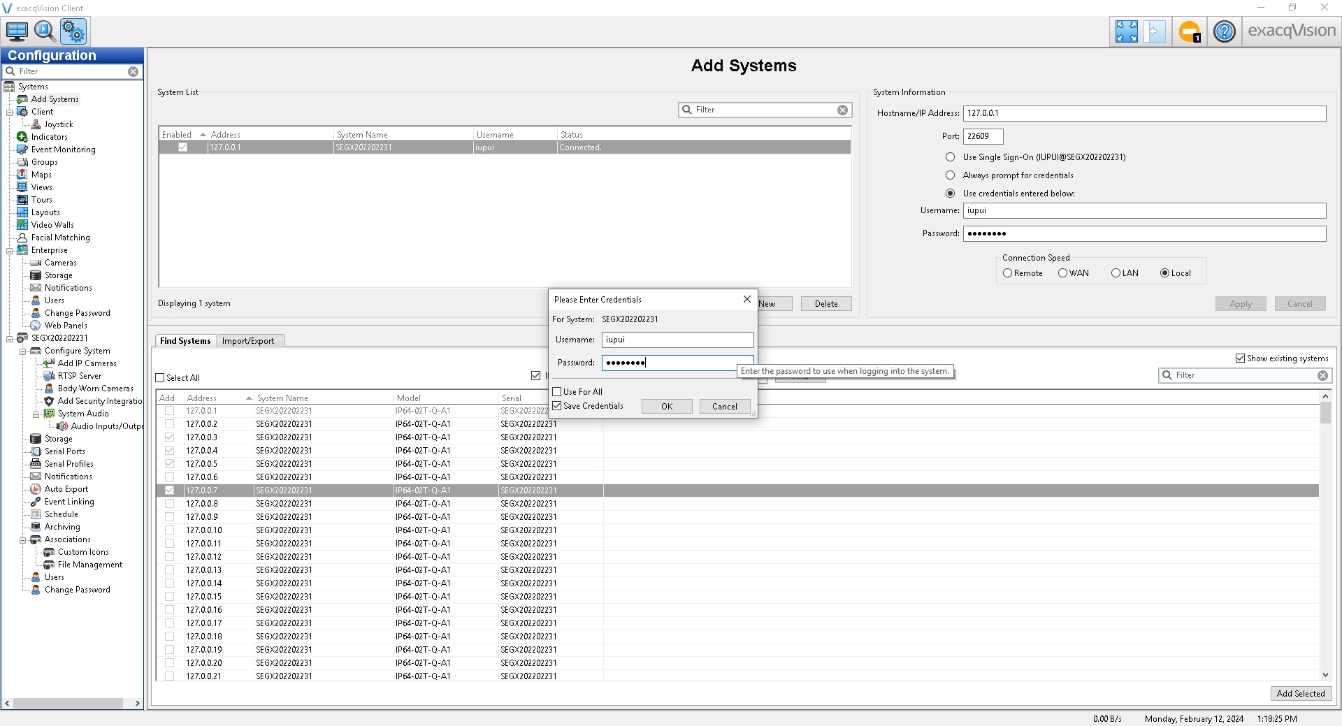
New look to the add server screen
The old screen had ambiguous labels and the information was scattered across the screen. I redesigned the screen to provide a clear visual hierarchy and a step-by-step process to add a server. This made it easier for the users to add a server and also reduced the cognitive load on them.

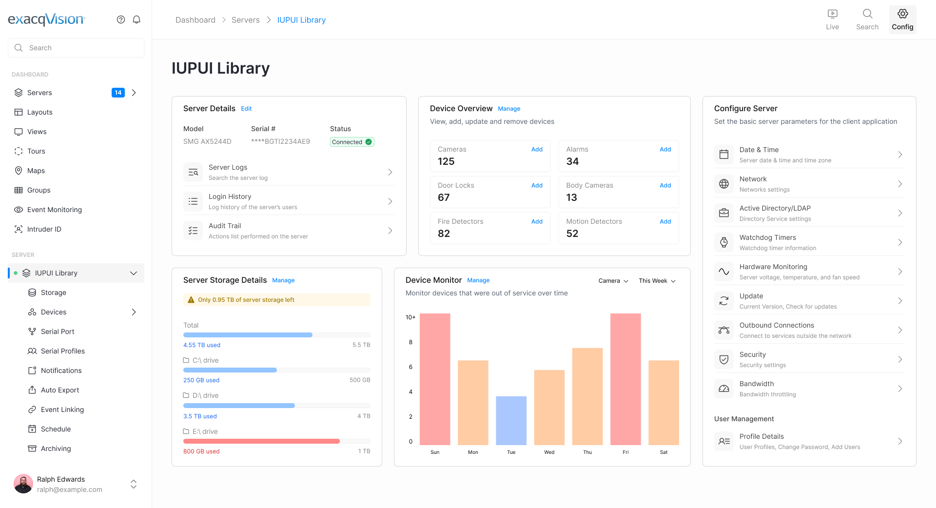
A unified dashboard for each server
The software lacked a dashboard which could provide an overview of all the details related to a server. Users had to navigate through multiple screens to find the information they were looking for. Although the software had a search functionality, users shared that they often had to remember the name of the service to find it. It was so innate to them that they didn't even realize that it was a problem.
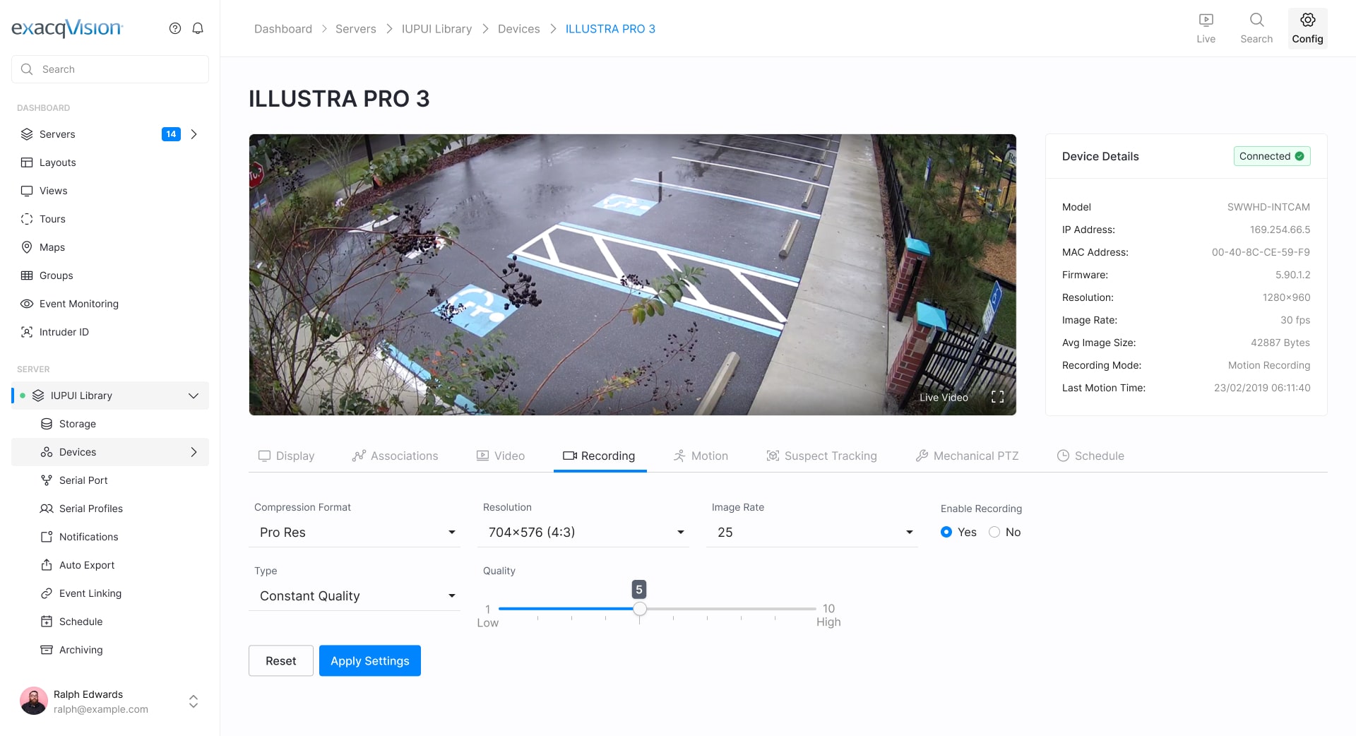
Modern and improved device view
The existing screen didn't come across as concerning since the users liked it but it was outdated and needed a fresh look. Thus, my goal here was to modernize the screen while keeping the existing layout intact.

Initial testing of the new designs with users was challenging because they had developed muscle memory with the existing software.
The users were so accustomed to the existing software that they were comfortable with the current layout and user flows. Beyond think-aloud sessions, comparing their time to complete a task with the new design wasn't helpful. Therefore, we had to adopt to a new approach to test the designs.
Progressive Testing
Through this approach we intended to test our designs incrementally, starting with the basic changes and gradually
moving to the more complex ones as we received feedback. This helped the users to adapt to the new designs and also
provided us with valuable insights to improve the designs.
Feel free to reach out to know more about the testing and the results.

The impact of my work
The redesign proved to be a catalyst for change and was genuinely well received by the target users and the stakeholders.
Redesign proved as a catalyst
The redesign helped us put forth a fresh perspective on the software and the users were excited about the new look and feel. Moving forward, the team at Johnson Controls is planning to expand their redesign initiatives for other products as well.
Significant revenue potential
A fresh and modern look to the software meant that the software could now compete with the other players in the market. It can not only retain the existing users but also attract new users. This will have a significant impact on the revenue and the market share of the software.
Positively impacting 100k+ active users
The software is used by over 100k active users and the redesign will have a positive impact on all of them. During our conversations with the users post the redesign, they expressed their happiness with the new look and feel of the software. This was new for me as I had never seen users so attached to a software. Maybe it was because they were using for so long and the redesign was a breath of fresh air for them.
Learnings and reflections
My collaboration with Johnson Controls was a great learning experience and gave me insights into the world of enterprise software design.
Finding enterprise products to try out is hard
When working on enterprise products that are intended for a niche set of users, finding product inspiration for a quick trial can be hard. We had a hard time finding products that were similar to ours and download and try them. What helped was YouTube videos and product documentation of the competitors.
A major change meant steep learning curve
Users of enterprise software are used to the existing interface and changing it completely would mean a steep learning curve. Thus, the best approach was to make incremental changes to the software which wouldn't disrupt the user's workflow.
Regular stakeholder collaboration helps
Regular collaboration with the stakeholders helped us to align our design decisions with the business goals. It also meant we received progressive feedback and breaking down bigger tasks into smaller ones. Thus we were able to iterate on the designs quickly.